Advanced data preparation
Overview
Teaching: min
Exercises: minQuestions
Objectives
Dataframes
Data Frames are data displayed in a format as a table and are a powerful tool when it comes to performing more advanced computational methods.
Creating a Dataframe
Data Frames can have different types of data inside it. While the first column can be character, the second and third can be numeric or logical. However, each column should have the same type of data.
Data_Frame <- data.frame (
Training = c("Strength", "Stamina", "Other"),
Pulse = c(100, 150, 120),
Duration = c(60, 30, 45))

# Print the data frame
Data_Frame
  Training Pulse Duration
1 Strength   100       60
2  Stamina   150       30
3    Other   120       45
Summarising dataframes
Use the summary() function to summarize the data from a Data Frame:
Data_Frame <- data.frame (
Training = c("Strength", "Stamina", "Other"),
Pulse = c(100, 150, 120),
Duration = c(60, 30, 45))

Data_Frame

summary(Data_Frame)
  Training             Pulse          Duration
 Length:3           Min.   :100.0   Min.   :30.0
 Class :character   1st Qu.:110.0   1st Qu.:37.5
 Mode  :character   Median :120.0   Median :45.0
                    Mean   :123.3   Mean   :45.0
                    3rd Qu.:135.0   3rd Qu.:52.5
                    Max.   :150.0   Max.   :60.0
Accessing items in a dataframe
We can use single brackets [ ], double brackets [[ ]] or $ to access columns from a data frame:
Data_Frame <- data.frame (
Training = c("Strength", "Stamina", "Other"),
Pulse = c(100, 150, 120),
Duration = c(60, 30, 45))

Data_Frame[1]

Data_Frame[["Training"]]

Data_Frame$Training
Data_Frame[1]
  Training
1 Strength
2  Stamina
3    Other

Data_Frame[["Training"]]
[1] "Strength" "Stamina"  "Other"

Data_Frame$Training
[1] "Strength" "Stamina"  "Other"
Adding rows
Use the rbind() function to add new rows in a Data Frame:
Data_Frame <- data.frame (
Training = c("Strength", "Stamina", "Other"),
Pulse = c(100, 150, 120),
Duration = c(60, 30, 45))

# Add a new row
New_row_DF <- rbind(Data_Frame, c("Strength", 110, 110))

# Print the new row
New_row_DF
  Training Pulse Duration
1 Strength   100       60
2  Stamina   150       30
3    Other   120       45
4 Strength   110      110
Adding columns
Use the cbind() function to add new columns in a Data Frame:
Data_Frame <- data.frame (
Training = c("Strength", "Stamina", "Other"),
Pulse = c(100, 150, 120),
Duration = c(60, 30, 45))
New_col_DF <- cbind(Data_Frame, Steps = c(1000, 6000, 2000))# Add a new column
New_col_DF # Print the new column
Training Pulse Duration Steps
1 Strength   100       60  1000
2  Stamina   150       30  6000
3    Other   120       45  2000
Remove Rows and Columns
Use the c() function to remove rows and columns in a Data Frame:
Data_Frame <- data.frame (
Training = c("Strength", "Stamina", "Other"),
Pulse = c(100, 150, 120),
Duration = c(60, 30, 45))

Data_Frame_New <- Data_Frame[-c(1), -c(1)]# Remove the first row and column

Data_Frame_New # Print the new data frame
Training Pulse Duration Steps
  Pulse Duration
2   150       30
3   120       45
Amount of Rows, Columns and length of dataframe
Use the dim() function to find the amount of rows and columns in a Data Frame:
Data_Frame <- data.frame (
Training = c("Strength", "Stamina", "Other"),
Pulse = c(100, 150, 120),
Duration = c(60, 30, 45))

dim(Data_Frame)
ncol(Data_Frame)
nrow(Data_Frame)
length(Data_Frame)
> dim(Data_Frame)
[1] 3 3
> ncol(Data_Frame)
[1] 3
> nrow(Data_Frame)
[1] 3
> length(Data_Frame)
[1] 3
Combining Data Frames
Use the rbind() function to combine two or more data frames in R vertically:
Data_Frame1 <- data.frame (
Training = c("Strength", "Stamina", "Other"),
Pulse = c(100, 150, 120),
Duration = c(60, 30, 45))

Data_Frame2 <- data.frame (
Training = c("Stamina", "Stamina", "Strength"),
Pulse = c(140, 150, 160),
Duration = c(30, 30, 20))

New_Data_Frame <- rbind(Data_Frame1, Data_Frame2)
New_Data_Frame
  Training Pulse Duration
1 Strength   100       60
2  Stamina   150       30
3    Other   120       45
4  Stamina   140       30
5  Stamina   150       30
6 Strength   160       20
Use the rbind() function to combine two or more data frames in R vertically:
Data_Frame3 <- data.frame (
Training = c("Strength", "Stamina", "Other"),
Pulse = c(100, 150, 120),
Duration = c(60, 30, 45))

Data_Frame4 <- data.frame (
Steps = c(3000, 6000, 2000),
Calories = c(300, 400, 300))

New_Data_Frame1 <- cbind(Data_Frame3, Data_Frame4)
New_Data_Frame1
  Training Pulse Duration Steps Calories
1 Strength   100       60  3000      300
2  Stamina   150       30  6000      400
3    Other   120       45  2000      300
Remove rows with missing values
What are missing values?
Missing values are the data points that are absent for a specific variable in a dataset. It can be represented in various ways such as Blank spaces, null values, or any special symbols like”NA”.Because of these various reasons missing values can occur, such as data entry errors, malfunction in equipment…etc.Dealing with missing data is a crucial step in data analysis. Some of the methods are.
- na.omit()
- complete.cases()
Removing rows with na.omit
df1= data.frame(
A1 = c(NA, 10, NA, 7, 8, 11,20),
A2 = c("A", 9, 3, "B", "C", "D","E"),
A3 = c(1, 0, NA, 1, 1, NA,3))
print(df1) #printing the dataframe

print("After removing the NA values ")
result=na.omit(df1)
print(result)
> print(df1)
  A1 A2 A3
1 NA  A  1
2 10  9  0
3 NA  3 NA
4  7  B  1
5  8  C  1
6 11  D NA
7 20  E  3
>
> print("After removing the NA values ")
[1] "After removing the NA values "

  A1 A2 A3
2 10  9  0
4  7  B  1
5  8  C  1
7 20  E  3
Remove rows with missing values using complete.cases()
df1 <- data.frame(
A1 = c(NA, 10, NA, 7, 8, 11,20),
A2 = c("A", 9, 3, "B", "C", "D","E"),
A3 = c(1, 0, NA, 1, 1, NA,3))
print(df1)#printing the dataframe

print("After removing the NA values ")
result=df1[complete.cases(df1),]
print(result)
> #printing the dataframe
> print(df1)
  A1 A2 A3
1 NA  A  1
2 10  9  0
3 NA  3 NA
4  7  B  1
5  8  C  1
6 11  D NA
7 20  E  3
>
> print("After removing the NA values ")
[1] "After removing the NA values "

  A1 A2 A3
2 10  9  0
4  7  B  1
5  8  C  1
7 20  E  3
Identify and Remove Duplicate Data
Identifying Duplicate Data in vector
vector_data <- c(1, 2, 3, 4, 4, 5) # Create a sample vector with duplicate elements
duplicated(vector_data) # Identify duplicate elements
sum(duplicated(vector_data)) # count of duplicated data
[1] FALSE FALSE FALSE FALSE  TRUE FALSE
[1] 1
Removing Duplicate Data in vector
vector_data <- c(1, 2, 3, 4, 4, 5)
unique(vector_data)# Remove duplicate elements
[1] 1 2 3 4 5
Identifying Duplicate Data in a data frame
student_result=data.frame(name=c("Ram","Geeta","John",
"Paul","Cassie","Geeta","Paul"),maths=c(7,8,8,9,10,8,9),
science=c(5,7,6,8,9,7,8),
history=c(7,7,7,7,7,7,7))


student_result # Printing data
duplicated(student_result)
sum(duplicated(student_result))
    name maths science history
1    Ram     7       5       7
2  Geeta     8       7       7
3   John     8       6       7
4   Paul     9       8       7
5 Cassie    10       9       7
6  Geeta     8       7       7
7   Paul     9       8       7
[1] FALSE FALSE FALSE FALSE FALSE  TRUE  TRUE
[1] 2
Removing Duplicate Data in a data frame
student_result=data.frame(name=c("Ram","Geeta","John","Paul",
"Cassie","Geeta","Paul"),
maths=c(7,8,8,9,10,8,9),
science=c(5,7,6,8,9,7,8),
history=c(7,7,7,7,7,7,7))


student_result # Printing data
unique(student_result)
    name maths science history
1    Ram     7       5       7
2  Geeta     8       7       7
3   John     8       6       7
4   Paul     9       8       7
5 Cassie    10       9       7
6  Geeta     8       7       7
7   Paul     9       8       7

    name maths science history
1    Ram     7       5       7
2  Geeta     8       7       7
3   John     8       6       7
4   Paul     9       8       7
5 Cassie    10       9       7
How to Combine Two Columns into One
Using paste() function is used to join the two columns in the dataframe with a separator.
data = data.frame(firstname=c("akash", "kyathi", "preethi"),
lastname=c("deep", "lakshmi", "savithri"),
marks=c(89, 96, 89))
print(data)# display

data$fullname = paste(data$firstname, data$lastname, sep=" ")# combine first name and last name columns

data # display
   firstname lastname marks
1     akash     deep    89
2    kyathi  lakshmi    96
3   preethi savithri    89

  firstname lastname marks         fullname
1     akash     deep    89       akash deep
2    kyathi  lakshmi    96   kyathi lakshmi
3   preethi savithri    89 preethi savithri
How to convert a column to binaries
To do this we us the ifelse method
data = data.frame(firstname=c("akash", "kyathi", "preethi"),
lastname=c("deep", "lakshmi", "savithri"),
marks=c(55, 45, 80),
subject=c("maths","science", "maths"))

data$markspass <- ifelse(data$marks >= 50, 1, 0)
print(data)# display
data$subject_maths <- ifelse(data$subject == "maths", 1, 0)

data # display
  firstname lastname marks subject markspass
1     akash     deep    55   maths         1
2    kyathi  lakshmi    45 science         0
3   preethi savithri    80   maths         1

  firstname lastname marks subject markspass subject_maths
1     akash     deep    55   maths         1             0
2    kyathi  lakshmi    45 science         0             1
3   preethi savithri    80   maths         1             0
Assessing machine learning models with AIC
What is AIC?
Akaike information criterion (AIC) is most commonly used when evaluating a model’s performance on a test set is difficult, such as in small datasets or time series analysis. It is especially useful for time series because the most valuable data points are often the most recent, which are typically reserved for validation and testing. By training on the entire dataset and using AIC, model selection can be improved compared to traditional train/validation/test approaches.
AIC assesses a model’s fit on the training data while incorporating a penalty for complexity, similar to regularisation. The goal is to minimise AIC, striking the best balance between model fit and generalisability. This ultimately helps maximise performance on out-of-sample data.
AIC evaluates a model’s fit using its maximum likelihood estimation (log-likelihood). Log-likelihood quantifies how probable the observed data is given the model, with higher values indicating a better fit. The natural logarithm of the likelihood is used for computational simplicity.
Models with higher log-likelihoods tend to have lower AIC values, meaning they fit the data well. However, AIC also includes a penalty for model complexity—models with more parameters are more prone to over-fitting. This balance helps identify models that generalise better to unseen data.
when should you use AIC?
AIC is commonly used when out-of-sample data is unavailable, when comparing multiple model types, or for efficiency. Recently, I used AIC to quickly evaluate several seasonal autoregressive integrated moving average (SARIMA) models to determine the best baseline while keeping the full dataset in my training set.
When applying AIC to SARIMA models, it’s important to recognize that AIC assumes all models are trained on the same data. This means using AIC to compare models with different orders of differencing is technically invalid, as each additional differencing order removes a data point. To use AIC correctly, you must ensure its assumptions are met. AIC assumes that you:
- Are using the same data between models.
- Are measuring the same outcome variable between models.
- Have a sample of infinite size.
The last assumption exists because AIC converges to the correct solution as the sample size approaches infinity. In practice, a large enough sample can provide a good approximation. However, since AIC is often used in small-sample scenarios, an adjusted version called AICc is available. AICc includes a correction term that aligns with AIC for large samples but provides a more accurate estimate for smaller ones.
As a general rule, it’s safest to use AICc by default. It becomes especially important when the ratio of data points (n) to the number of parameters (k) is less than 40.
Once the assumptions of AIC (or AICc) are met, one of its biggest advantages is that models do not need to be nested for valid comparisons. This contrasts with other single-number measures of model fit, such as the likelihood-ratio test, which requires nested models (where one model’s parameters are a subset of another’s). Because of this, AIC allows for direct comparison between vastly different models.
How Should AIC Results Be Interpreted?
Once you have a set of AIC scores, what’s the next step? Should you simply choose the model with the lowest score? While that’s an option, AIC scores provide a probabilistic ranking of models based on their likelihood of minimizing information loss (i.e., best fitting the data). This concept is better understood through the formula below.
Suppose you have calculated AIC scores for multiple models, resulting in a series (AIC₁, AIC₂, …, AICₙ). For any given AICᵢ, you can determine the probability that the “i-th” model minimizes information loss using the following formula, where AICₘᵢₙ represents the lowest AIC score in the set.
For example, suppose you have three candidate models with AIC values of 100, 102, and 110. The second model is exp((100 − 102)/2) = 0.368 times as likely as the first model to minimize information loss. Similarly, the third model is exp((100 − 110)/2) = 0.007 times as likely as the first model to do so.
This illustrates that AIC alone cannot definitively determine whether one model is better than another—it relies solely on in-sample data. However, there are strategies to interpret and handle these probabilistic results effectively:
- Set an alpha level that, below which, competing models will be dismissed. Alpha = 0.05, for instance, would dismiss the 110-score model at 0.007.
- If you find competing models above your alpha level, you can create a weighted sum of your models in proportion to their probability. A 1:0.368, in the case of the 100 and 102-scored models.
If absolute precision isn’t critical and you simply want to choose the model with the lowest AIC, be aware that a small difference in AIC scores suggests a higher likelihood of selecting a suboptimal model. When multiple models have AIC scores close to the minimum, the distinction between them is less clear. For instance, a score of 100 versus 100.1 may not strongly favour one model over the other, whereas a comparison between 100 and 120 would indicate a much clearer preference.
Problems with AIC
Remember, AIC only measures the relative quality of models, meaning that even the best model in your comparison could still have a poor fit. To ensure your model meets an acceptable absolute standard, additional metrics, such as Mean Absolute Percentage Error (MAPE), should be used.
AIC is also a relatively simple calculation and has been expanded upon by more advanced, computationally intensive methods that often provide greater accuracy. Examples include the Deviance Information Criterion (DIC), Watanabe-Akaike Information Criterion (WAIC), and Leave-One-Out Cross-Validation (LOO-CV), which AIC asymptotically approaches as sample size increases.
The choice between AIC and these newer methods depends on your priorities—whether you prioritise accuracy, computational efficiency, or the ease of calculation based on your software’s capabilities. In most cases where sufficient data is available, the best way to evaluate model performance is through traditional machine learning practices, using train, validation, and test sets. However, when such an approach isn’t feasible—such as in small datasets or time series analysis—AIC can be a valuable alternative for model evaluation.
Variable selection functions
Drop1 method
The given AIC from drop1 relates to the whole model - not to a variable, so the output tells you which variable to remove in order to yield the model with the lowest AIC. For example, with the built-in dataset swiss
lm1 <- lm(Fertility ~ ., data = swiss)
drop1(lm1, test = "F")  # So called 'type II' anova
Single term deletions

Model:
Fertility ~ Agriculture + Examination + Education + Catholic +
    Infant.Mortality
                 Df Sum of Sq    RSS    AIC F value    Pr(>F)
<none>                        2105.0 190.69
Agriculture       1    307.72 2412.8 195.10  5.9934  0.018727 *
Examination       1     53.03 2158.1 189.86  1.0328  0.315462
Education         1   1162.56 3267.6 209.36 22.6432 2.431e-05 ***
Catholic          1    447.71 2552.8 197.75  8.7200  0.005190 **
Infant.Mortality  1    408.75 2513.8 197.03  7.9612  0.007336 **
---
Signif. codes:  0 ‘***’ 0.001 ‘**’ 0.01 ‘*’ 0.05 ‘.’ 0.1 ‘ ’ 1
ANOVA for Comparing Models
Comparing two linear models is a fundamental task in statistical analysis, especially when determining if a more complex model provides a significantly better fit to the data than a simpler one. In R, the anova() the function allows you to perform an Analysis of Variance (ANOVA) to compare nested models.
The Analysis of Variance (ANOVA) technique compares two nested models to determine if the more complex model provides a significantly better fit to the data. The anova() function in R performs this comparison by calculating an F-statistic and a p-value. The null hypothesis is that the simpler model is adequate, and the alternative hypothesis is that the more complex model is better. If the p-value is small (typically less than 0.05), we reject the null hypothesis and conclude that the complex model provides a significantly better fit.
lm1 <- lm(Fertility ~ Agriculture, data = swiss)
lm2 <- lm(Fertility ~ Agriculture + Examination, data = swiss)
anova_result <- anova(lm1, lm2)
print(anova_result)
nalysis of Variance Table

Model 1: Fertility ~ Agriculture
Model 2: Fertility ~ Agriculture + Examination
  Res.Df    RSS Df Sum of Sq     F  Pr(>F)
1     45 6283.1
2     44 4072.7  1    2210.4 23.88 1.4e-05 ***
---
Signif. codes:  0 ‘***’ 0.001 ‘**’ 0.01 ‘*’ 0.05 ‘.’ 0.1 ‘ ’ 1
Key Points
Advanced data preparation practical 1
Overview
Teaching: min
Exercises: minQuestions
Objectives
Exercise 1
library(palmerpenguins)
penguins
Exercise 1 tasks and solution
Your tasks are as follows:
1) Have a look at the data and can you see any issues you may have? after noticing the problem, its time to clean the data
2) Convert the “sex” label to 1 and 0s.
3) you have created 4 models for predicting the sex of penguins with different variables. the AIC values from you models are as follows model1:50, model2:48, model3:60, model4:53. Using a Alpha = 0.05, which models can be dismissed?
4) build a linear model using the penguin dataset base on sex prediction and use the drop1 method to find the optimal collection of variables.
Solution
1) The issue is that we have some missing values and if we want to do any sort of linear regression they will need to be removed. 1) penguins=na.omit(penguins) 1) penguins
2) either penguin$sex <- ifelse(penguin$sex == “male”, 0, 1) or penguin$sex <- ifelse(penguin$sex == “female”, 0, 1)
3) assuming to 3dp, model1: 0.368, model3:0.003, model4:0.082. We can therefore reject model3. 3) What value would model4 need to get for us to reject it?
4) lm1 <- lm(sex ~ ., data = penguins)
4) drop1(lm1, test = “F”) # So called ‘type II’ anova
4) species + island + bill_length_mm + bill_depth_mm + flipper_length_mm + body_mass_g + year
Key Points
Linear models (LM)
Overview
Teaching: min
Exercises: minQuestions
Objectives
What are Linear models
Linear models represent a continuous response variable as a function of one or more predictor variables. They are useful for understanding and predicting the behaviour of complex systems, as well as analysing experimental, financial, and biological data.
In this course, we will briefly explore Linear Regression, a statistical method used to construct a linear model. This model defines the relationship between a dependent variable y (also known as the response) and one or more independent variables χi (referred to as predictors). There our model takes the form of the following equation:
where β represents linear parameter estimates to be computed and ε represents the error terms that is assumed to be normally distributed.
Key assumptions
-
Response y is continuous
- Errors 𝜀 are:
- Normally distributed
- Have constant variance (homoscedasticity)
- Independent
- Relationship between predictors and response is linear
Typical use cases
- Predicting:
- Height
- Temperature
- Income
- House prices
There are several types of linear regression:
- Simple linear regression: models using only one predictor
- Multiple linear regression: models using multiple predictors
- Multivariate linear regression: models for multiple response variables
For this course will refine our selves to a short introduction into simple regression, so lets have at how we would go about calculating a line of best fit with an example.
Linear models using the iris dataset
For this analysis, we will use the built-in cars dataset, which comes with R by default. This dataset is widely used for demonstrating linear regression in a straightforward and accessible way. You can access it by typing cars in your R console. The dataset contains 50 observations (rows) and 2 variables (columns): Petal.L and Petal.L. Let’s print the dataset to see what it includes.
iris
head(iris)
Now before we move on to creating a simple linear regression model, its always go practise to analyse our dataset first such that we can fully understand the variables. Therefore lets conduct some graphical analysis.
Graphical analysis
The goal of this exercise is to build a simple regression model to predict Sepal.L by identifying a statistically significant linear relationship with Petal.L. Before diving into the syntax, let’s first explore these variables graphically.
To better understand the behaviour of the predictor variable, we typically use the following visualisations:
- Scatter Plot: Helps visualise the linear relationship between the predictor and response variables.
- Box Plot: Identifies potential outliers in the predictor variable. Outliers can significantly impact predictions by influencing the slope and direction of the best-fit line.
- Density Plot: Shows the distribution of the predictor variable. Ideally, the distribution should be approximately normal (a bell-shaped curve) without significant skewness.
Now, let’s create these plots to analyse the dataset.
Scatter Plot
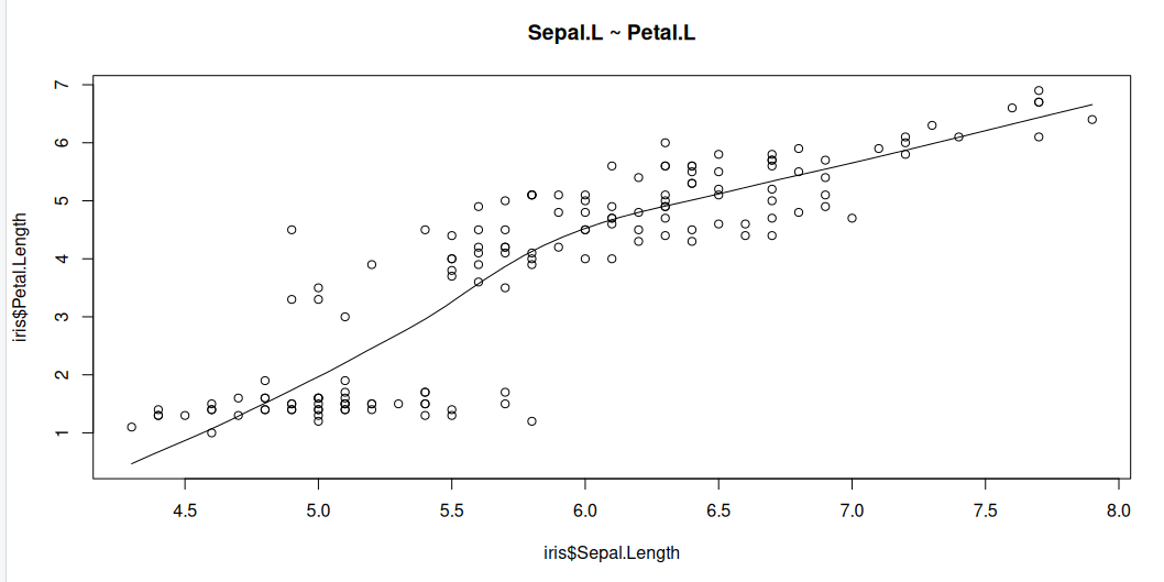
Scatter plots can help visualise any linear relationships between the dependent (response) variable and independent (predictor) variables. Ideally, if you are having multiple predictor variables, a scatter plot is drawn for each one of them against the response, along with the line of best as seen below.
scatter.smooth(x=iris$Sepal.Length, y=iris$Petal.Length, main="Sepal.L ~ Petal.L") # scatterplot
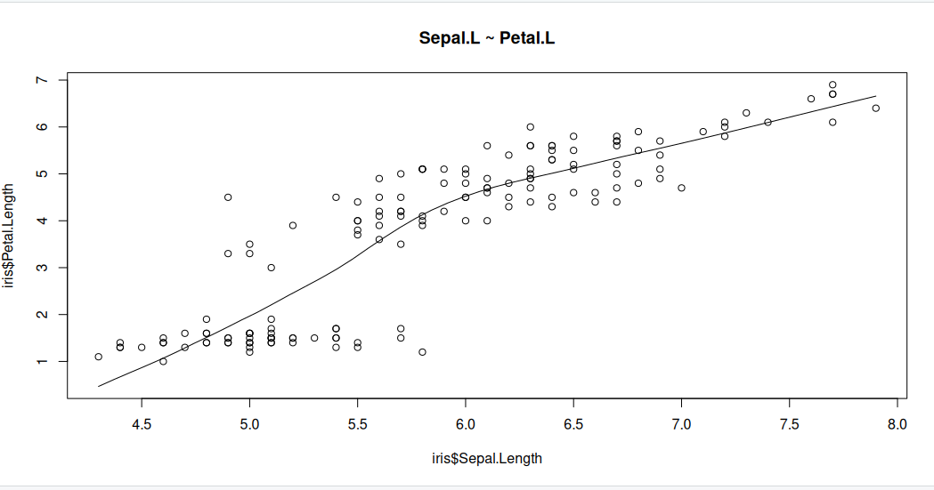
The scatter plot along with the smoothing line above suggests a linearly increasing relationship between the ‘Sepal.L’ and ‘Petal.L’ variables. This is a good thing, because, one of the underlying assumptions in linear regression is that the relationship between the response and predictor variables is linear and additive.
Boxplot to check for outliers
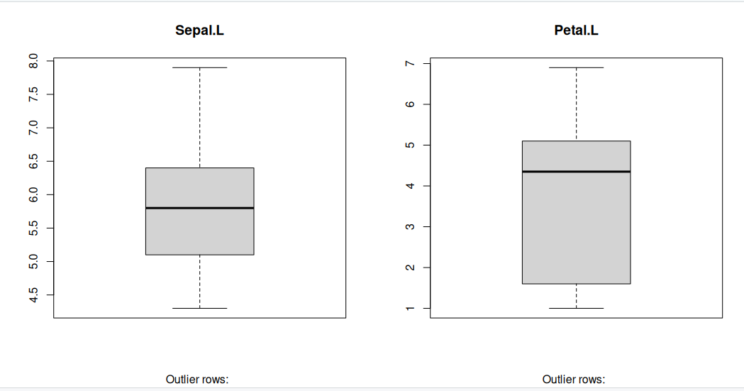
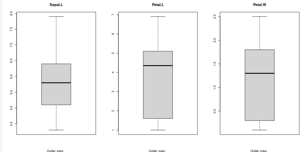
Generally, any datapoint that lies outside the 1.5 * interquartile-range (1.5 * IQR) is considered an outlier, where, IQR is calculated as the distance between the 25th percentile and 75th percentile values for that variable.
par(mfrow=c(1, 2))  # divide graph area in 2 columns
boxplot(iris$Sepal.Length, main="Sepal.L", sub=paste("Outlier rows: ", boxplot.stats(iris$Sepal.Length)$out))  # box plot for 'Sepal.L'
boxplot(iris$Petal.Length, main="Petal.L", sub=paste("Outlier rows: ", boxplot.stats(iris$Petal.Length)$out))  # box plot for 'Petal.L'
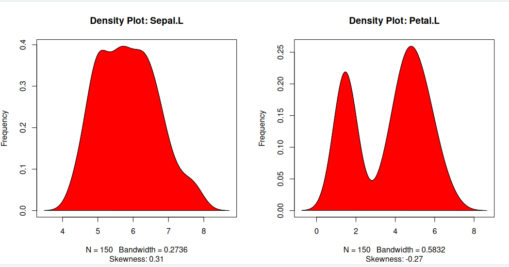
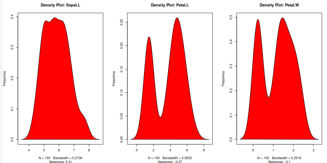
Density plot – Check if the response variable is close to normality
Its a good idea to check if our data takes the form of a normal distribution, to make choosing to use linear regression applicable.
install.packages("e1071")
library(e1071)
par(mfrow=c(1, 2))  # divide graph area in 2 columns
plot(density(iris$Sepal.Length), main="Density Plot: Sepal.L", ylab="Frequency", sub=paste("Skewness:", round(e1071::skewness(iris$Sepal.Length), 2)))  # density plot for 'Sepal.L'
polygon(density(iris$Sepal.Length), col="red")
plot(density(iris$Petal.Length), main="Density Plot: Petal.L", ylab="Frequency", sub=paste("Skewness:", round(e1071::skewness(iris$Petal.Length), 2)))  # density plot for 'Petal'
polygon(density(iris$Petal.Length), col="red")
Correlation
Correlation is a statistical measure that indicates the degree of linear dependence between two paired variables, such as Petal.L and Sepal.L in our dataset. It ranges from -1 to +1:
- A correlation close to +1 suggests a strong positive relationship, meaning that as Sepal.L increases, Petal.L also tends to increase.
- A correlation close to -1 indicates a strong negative relationship, where an increase in Sepal.L corresponds to a decrease in Petal.L.
- A correlation near 0 implies a weak or no linear relationship between the variables.
If the correlation is low (between -0.2 and 0.2), it suggests that the predictor (X) explains little of the variation in the response variable (Y). In such cases, we may need to explore alternative explanatory variables for better predictions.
cor(iris$Sepal.Length, iris$Petal.Length) # calculate correlation between Sepal.L and Petal.L
[1] 0.8717538
Building a linear model
Now that we’ve visualized the linear relationship using a scatter plot and confirmed it by calculating the correlation, let’s move on to building the linear model.
In R, we use the lm() function to create linear models. This function requires two main arguments:
- Formula – Defines the relationship between the response and predictor variables.
- Data – A dataset (typically a data.frame) containing the variables.
Although the formula can be stored as an object of class formula, it is most commonly written directly within the function call, as shown in the example below.
linearMod <- lm(Sepal.Length ~ Petal.Length, data=iris)  # build linear regression model on full data
print(linearMod)
Call:
lm(formula = Sepal.Length ~ Petal.Length, data = iris)

Coefficients:
 (Intercept)  Petal.Length
      4.3066        0.4089
Now that we’ve built the linear model, we have defined the relationship between the predictor Petal.L and the response Sepal.L in the form of a mathematical equation.
From the model output, you’ll notice the Coefficients section, which consists of two components:
- Intercept: 4.3066
- Petal.Length: 0.4089
These values are known as beta coefficients, and they define the equation for Sepal.L as a function of Petal.L: Sepal.L = Intercept + (β ∗ Petal.L) Substituting the values: => Sepal.L = 4.3066 + 0.4089∗Petal.L
Linear regression diagnostics
Now that we’ve built the linear model and derived a formula to predict Sepal.L based on a given Petal.L, can we immediately start using it? Not yet!
Before applying a regression model, we must first verify its statistical significance. But how do we do that?
A good starting point is to examine the summary statistics of our model. Let’s print the summary of linearMod to evaluate its significance and performance.
summary(linearMod) # model summary
Call:
lm(formula = Sepal.Length ~ Petal.Length, data = iris)

Residuals:
     Min       1Q   Median       3Q      Max
-1.24675 -0.29657 -0.01515  0.27676  1.00269

Coefficients:
             Estimate Std. Error t value Pr(>|t|)
(Intercept)   4.30660    0.07839   54.94   <2e-16 ***
Petal.Length  0.40892    0.01889   21.65   <2e-16 ***
---
Signif. codes:  0 ‘***’ 0.001 ‘**’ 0.01 ‘*’ 0.05 ‘.’ 0.1 ‘ ’ 1

Residual standard error: 0.4071 on 148 degrees of freedom
Multiple R-squared:   0.76,	Adjusted R-squared:  0.7583
F-statistic: 468.6 on 1 and 148 DF,  p-value: < 2.2e-16
-
Model formula: A quick reminder of the model formula that was fit.
-
Residuals: Residuals are very important as they represent the distance that each observation is from the fitted model. Obviously, we want the fitted model that best describes the data, but there will be some residual error no matter what. What is most important with residuals is that they are normally distributed around 0. If they are not centered around 0, it means the model is over or under predicting too many points. And if the residuals are not normal (i.e., symmetric), it also means something is not being fit well. We don’t need a mean exactly at 0 and perfect symmetry, but we do want to avoid major deviations relative to the data. We want a median residual around 0, and the Min and Max to be relatively the same.
-
Coefficients: These are simply the parameter estimates. In the model above, the intercept i estimated to be 2.494 and the slope of x is estimated to be 1.299. They will be accompanied by a standard error (Std. Error), which is a measure of uncertainty around the estimate. Finally, the t value is the test statistics that feeds directly into the p-value:
The p-value is likely what you will look at first, but please recall that a p-value is only as good as the model is for the data; in other words, a significant p-value is meaningless or even dangerous if the model is a poor fit for the data.
-
Significance codes: I suggest to avoid these at all cost. If you want to play by the rules of p-values, then a priori select a significance threshold and that is the only significance threshold that should mean anything. Most people select 0.05.
-
Residual standard error: This is the standard deviation (spread) of residuals. You may find it useful, but it is not often reported.
-
Multiple R-squared: % of variance explained by model. Personally, I am not a big user of R2 values or their variants. The reasons behind this get into a longer discussion that we won’t have, but in general I think there more more effective ways to report on a model. Nevertheless, R2 is a common model metric and some people will want to know it. Just be reminded that while a higher R2 is “better”, R2 always increases with additional model terms
-
Adjusted R-squared: % of variance explained by model adjusted for more model terms that may not be that explanatory. Basically, this metric is like R2, but not as liberal as the regular R2. The formula for the adjusted R2 is:
- F-statistic: The F-statistic is another test statistic, but one for the model (compared the t statistics which were for individual coefficients). F-statistic tests the null hypothesis that all model coefficients = 0 (ratio of two variances: variance explained by parameters and residual, unexplained variance). You will not typically report an F-statistic in a linear regression model, but you will for an ANOVA.
The p Value: Checking for statistical significance
The summary statistics provide valuable insights into our model’s reliability. Two key aspects to examine are:
- The model’s overall p-value (found in the last line of the output).
- The p-values of individual predictor variables (located in the rightmost column under “Coefficients”).
Understanding p-values
P-values are crucial because a linear model is considered statistically significant only if both the model’s p-value and the predictor’s p-value are less than 0.05 (the standard significance level). This is visually represented by significance stars next to each variable—more stars indicate higher significance.
###Null and Alternative Hypotheses
Every p-value corresponds to a hypothesis test:
- Null Hypothesis (H₀): The coefficient of the predictor is zero, meaning no relationship exists between the independent and dependent variable.
- Alternative Hypothesis (H₁): The coefficient is not zero, indicating a significant relationship.
Interpreting the t-value
The t-value measures how strongly a predictor variable influences the response variable:
- A larger t-value suggests a lower probability that the coefficient is zero by chance, meaning the predictor is more significant.
- The p-value:
tells us the probability of obtaining such a high t-value under the null hypothesis. A low p-value (< 0.05) means the coefficient is significantly different from zero.
What This Means for Our Model
In our case, both the model’s and the predictor’s p-values in linearMod are well below 0.05. This allows us to reject the null hypothesis and conclude that the predictor Petal.L has a statistically significant relationship with Sepal.L.
Ensuring statistical significance is critical before using a model for predictions—without it, our predictions may lack reliability and could simply be due to chance.
How to calculate the t Statistic and p-Values?
When the model co-efficients and standard error are known, the formula for calculating t Statistic and p-Value is as follows:
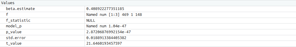
modelSummary <- summary(linearMod)  # capture model summary as an object
modelCoeffs <- modelSummary$coefficients  # model coefficients
beta.estimate <- modelCoeffs["Petal.Length", "Estimate"]  # get beta estimate for Petal.L
std.error <- modelCoeffs["Petal.Length", "Std. Error"]  # get std.error for Petal.L
t_value <- beta.estimate/std.error  # calc t statistic
p_value <- 2*pt(-abs(t_value), df=nrow(iris)-ncol(iris))  # calc p Value
f_statistic <- linearMod$fstatistic[1]  # fstatistic
f <- summary(linearMod)$fstatistic  # parameters for model p-value calc
model_p <- pf(f[1], f[2], f[3], lower=FALSE)
AIC and BIC
The Akaike’s information criterion - AIC (Akaike, 1974) and the Bayesian information criterion - BIC (Schwarz, 1978) are measures of the goodness of fit of an estimated statistical model and can also be used for model selection. Both criteria depend on the maximized value of the likelihood function L for the estimated model.
The AIC is defined as:
AIC = (−2) × ln(L) + (2×k)
where, k is the number of model parameters and the BIC is defined as:
BIC = (−2) × ln(L) + k × ln(n)
where, n is the sample size.
For model comparison, the model with the lowest AIC and BIC score is preferred.
AIC(linearMod)  # AIC
BIC(linearMod)  # BIC
[1] 160.0404
[[1] 169.0723
Predicting Linear Models
Up to this point, we’ve built a linear regression model using the entire dataset. However, this approach doesn’t allow us to assess how well the model will perform on new data.
A better practice is to split the dataset into training (80%) and test (20%) subsets. The model is trained on the 80% sample, and then its performance is evaluated by predicting the dependent variable on the test data.
By doing this, we obtain both:
- Predicted values for the test data.
- Actual values from the original dataset.
We can then measure the model’s accuracy using metrics like Min-Max Accuracy and error rates such as MAPE (Mean Absolute Percentage Error) or MSE (Mean Squared Error). These help determine how well the model generalises to new data.
Now, let’s walk through the process of implementing this approach.
Step 1: Create the training (development) and test (validation) data samples from original data.
# Create Training and Test data -
set.seed(100)  # setting seed to reproduce results of random sampling
trainingRowIndex <- sample(1:nrow(iris), 0.8*nrow(iris))  # row indices for training data
trainingData <- iris[trainingRowIndex, ]  # model training data
testData  <- iris[-trainingRowIndex, ]   # test data
Step 2: Develop the model on the training data and use it to predict the Sepal.L on test data
# Build the model on training data -
lmMod <- lm(Sepal.Length ~ Petal.Length, data=trainingData)  # build the model
SepalPred <- predict(lmMod, testData)  # predict Sepal.L
Step 3: Review diagnostic measures.
summary (lmMod)  # model summary
AIC (lmMod)
Call:
lm(formula = Sepal.Length ~ Petal.Length, data = trainingData)

Residuals:
     Min       1Q   Median       3Q      Max
-1.22492 -0.29158 -0.03953  0.26644  1.03312

Coefficients:
             Estimate Std. Error t value Pr(>|t|)
(Intercept)   4.27305    0.09128   46.81   <2e-16 ***
Petal.Length  0.41153    0.02216   18.57   <2e-16 ***
---
Signif. codes:  0 ‘***’ 0.001 ‘**’ 0.01 ‘*’ 0.05 ‘.’ 0.1 ‘ ’ 1

Residual standard error: 0.4185 on 118 degrees of freedom
Multiple R-squared:  0.7451,	Adjusted R-squared:  0.7429
F-statistic: 344.9 on 1 and 118 DF,  p-value: < 2.2e-16

[1] 135.477
From the model summary, the model p value and predictor’s p value are less than the significance level, so we know we have a statistically significant model. Also, the R-Sq and Adj R-Sq are comparative to the original model built on full data.
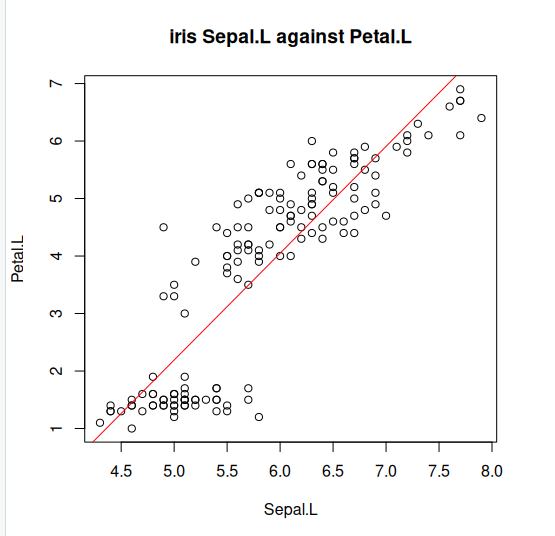
Step 4: Lets explore what our line of best fit looks like
plot(iris$Sepal.Length, iris$Petal.Length, pch=21, main="iris Sepal.L against Petal.L", xlab="Sepal.L", ylab="Petal.L")
abline(lm(Petal.Length ~ Sepal.Length, data=iris)$coefficients, col="red")
Key Points
Generalised linear models (GLM)
Overview
Teaching: min
Exercises: minQuestions
Objectives
what are GLMs
Generalised Linear Models are a broad class of statistical models used to describe relationships between a dependent variable and one or more independent variables. They extend ordinary linear regression by allowing for different types of dependent variables and error structures.
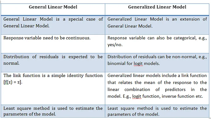
What are Generalised linear models
A Generalised Linear Model (GLMs) extends ordinary linear regression by allowing response variables to follow error distributions other than the normal (Gaussian) distribution which is a General linear model. Essentially, a GLM is a linear model with a modified error distribution that more accurately represents the data-generating process and has found common use for analysing data examples such as count data or binary. For example, if your response variable consists of binary outcomes, such as successes and failures coded as 1s and 0s, these values do not follow a normal distribution, nor would their residuals exhibit a normal error distribution. In such cases, adjusting the underlying distribution in the model ensures a better fit for the data.
We now create a basic linear model for a given dataset. It would be valuable to assess the accuracy of this model. One way to achieve this is by computing the predicted y-values for each x-value in our original dataset and comparing them with the actual y-values. We can aggregate these individual discrepancies into a single comprehensive error metric by calculating the least squares. This involves squaring each difference, summing them all, dividing the sum by the total number of observations, and then taking the square root of the result. By squaring and subsequently taking the square root, we prevent negative errors from offsetting positive ones, thus providing us with an overall error metric to gauge the accuracy of our model.
linear regression, logistic regression, and Poisson regression are really all special examples of a more general method, something called a “generalized linear model”. The great thing about “generalized linear models” is that they allow us to use “response” data that can take any value (like how big an organism is in linear regression), take only 1’s or 0’s (like whether or not someone has a disease in logistic regression), or take discrete counts (like number of events in Poisson regression).
Summary: What they are ?
- Extend linear models to handle non-normal response variables.
- Useful when the response is binary, count, or proportion data.
Three components of a GLM
- Random component
- Distribution of the response (from the exponential family)
- e.g. Normal, Binomial, Poisson
- Systematic component
- Linear predictor:
- Link function
- Connects the mean of y to the linear predictor:
Typical use cases
- Binary outcomes → Logistic regression
- Counts → Poisson regression
- Proportions → Binomial regression
GLM using iris dataset
We will use the “iris” dataset in R to illustrate the use of GLM. This dataset includes data on different car models, including Sepal.L, Petal.L, and Petal.W. The response variable will be “Sepal.L,” and the predictor factors will be “Petal.L” and “Petal.W”
iris
head(iris)
Now as we did before with the linear version, its a good idea to analyses our dataset first so lets visualise our data. But the issue this time is that we are considering two variables hp and wt that we should look at seperately.
Graphical analysis
Scatter Plot
Scatter plots can help visualise any linear relationships between the dependent (response) variable and independent (predictor) variables. Ideally, if you are having multiple predictor variables, a scatter plot is drawn for each one of them against the response, along with the line of best as seen below.
scatter.smooth(x=iris$Sepal.Length, y=iris$Petal.Length, main="Sepal.L ~ Petal.L")
scatter.smooth(x=iris$Sepal.Length, y=iris$Petal.Width, main="Sepal.L ~ Petal.W")
>

Boxplot to check for outliers
Generally, any datapoint that lies outside the 1.5 * interquartile-range (1.5 * IQR) is considered an outlier, where, IQR is calculated as the distance between the 25th percentile and 75th percentile values for that variable.
par(mfrow=c(1, 3))  # divide graph area in 2 columns
boxplot(iris$Sepal.Length, main="Sepal.L", sub=paste("Outlier rows: ", boxplot.stats(iris$Sepal.Length)$out))  # box plot for 'Sepal.L'
boxplot(iris$Petal.Length, main="Petal.L", sub=paste("Outlier rows: ", boxplot.stats(iris$Petal.Length)$out))  # box plot for 'Petal.L'
boxplot(iris$Petal.Width, main="Petal.W", sub=paste("Outlier rows: ", boxplot.stats(iris$Petal.Width)$out))  # box plot for 'Petal.W'
Density plot – Check if the response variable is close to normality
Its a good idea to check what form our data is in, to make choosing to use GLM applicable.
library(e1071)
par(mfrow=c(1, 3))  # divide graph area in 2 columns
plot(density(iris$Sepal.Length), main="Density Plot: Sepal.L", ylab="Frequency", sub=paste("Skewness:", round(e1071::skewness(iris$Sepal.Length), 2)))  # density plot for 'Sepal.L'
polygon(density(iris$Sepal.Length), col="red")
plot(density(iris$Petal.Length), main="Density Plot: Petal.L", ylab="Frequency", sub=paste("Skewness:", round(e1071::skewness(iris$Petal.Length), 2)))  # density plot for 'wt'
polygon(density(iris$Petal.Length), col="red")
plot(density(iris$Petal.Width), main="Density Plot: Petal.W", ylab="Frequency", sub=paste("Skewness:", round(e1071::skewness(iris$Petal.Width), 2)))  # density plot for 'wt'
polygon(density(iris$Petal.Width), col="red")
Building the model
The Gaussian family is used in this example, which implies that the response variable has a normal distribution. The glm() function yields an object of class “glm” containing model information such as coefficients and deviance.
model <- glm(Sepal.Length ~ Petal.Length + Petal.Width, data = iris, family = gaussian)
Why Gaussian family?
The model may be clearly understood in terms of the mean and variance of the response variable, which is one benefit of employing the Gaussian family. Additionally, the model can be fitted using the well-known and popular statistical technique known as maximum likelihood estimation.
summary(model)
Call:
glm(formula = Sepal.Length ~ Petal.Length + Petal.Width, family = gaussian,
    data = iris)

Coefficients:
             Estimate Std. Error t value Pr(>|t|)
(Intercept)   4.19058    0.09705  43.181  < 2e-16 ***
Petal.Length  0.54178    0.06928   7.820 9.41e-13 ***
Petal.Width  -0.31955    0.16045  -1.992   0.0483 *
---
Signif. codes:  0 ‘***’ 0.001 ‘**’ 0.01 ‘*’ 0.05 ‘.’ 0.1 ‘ ’ 1

(Dispersion parameter for gaussian family taken to be 0.1624537)

    Null deviance: 102.168  on 149  degrees of freedom
Residual deviance:  23.881  on 147  degrees of freedom
AIC: 158.05

Number of Fisher Scoring iterations: 2
A one-unit Petal.L increase predicts a 0.54178 Sepal increase, while Petal.W increase predicts a 0.31955 Sepal.L decrease. Significance: All coefficients (intercept, hp, wt) are statistically significant, ensuring reliability.
- Fit: Low residual deviance (23.881) versus null deviance (102.168) and AIC (158.05) indicate a well-fitting model.
- Dispersion (0.1624537) measures Sepal.L variability, essential for assessing prediction precision.
Visualise the model
plot(model, which = 1) # Plot the residual vs fitted values
plot(model, which = 2) # Plot the Q-Q plot of residuals
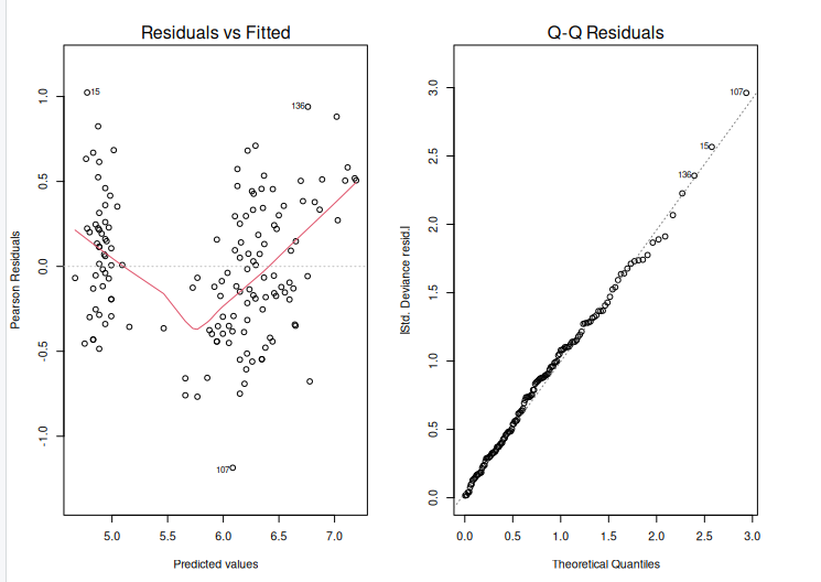
After creating an extended linear model, we must evaluate its fit to the data. This can be accomplished with the help of diagnostic graphs such as the residual plot and the Q-Q plot. The output is shown above.
The residual plot displays the residuals (differences between measured and predicted values) plotted against the fitted values. (i.e. the predicted values). We want to see a random scatter of residuals around zero, which indicates that the model is capturing the data trends. The residuals Q-Q plot displays the residuals plotted against the anticipated values if they were normally distributed. The points should follow a straight line, showing that the residuals are normally distributed.
Using ANOVA to compare two models
We will fit two glm models to the data:
- A simple model with fewer predictors.
- A complex model with more predictors.
We can now use the anova() function to compare the two models using a likelihood ratio test.
simple_model <- glm(Sepal.Length ~ Petal.Length, data = iris, family = gaussian)
complex_model <- glm(Sepal.Length ~ Petal.Length + Petal.Width, data = iris, family = gaussian)
model_comparison <-anova(simple_model, complex_model, test="Chisq")
Model 1: Sepal.Length ~ Petal.Length
Model 2: Sepal.Length ~ Petal.Length + Petal.Width
  Resid. Df Resid. Dev Df Deviance Pr(>Chi)
1       148     24.525
2       147     23.881  1  0.64434  0.04642 *
---
Signif. codes:  0 ‘***’ 0.001 ‘**’ 0.01 ‘*’ 0.05 ‘.’ 0.1 ‘ ’ 1
The anova() function performs the test, and the argument test = “Chisq” specifies that a chi-squared test should be used. The result will include the degrees of freedom (Df), deviance, and the p-value of the test.
p_value <- model_comparison$`Pr(>Chi)`[2]   # Second row for comparison between models
print(p_value)
[1] 0.04641967
Here, the Pr(>Chi) column holds the p-values, and we select the second row ([2]), which corresponds to the comparison between the two models. The resulting p_value will give the significance of adding the additional predictor(s) in the complex model.
- High p-value (p > 0.05): The simpler model is sufficient. There is no evidence that the complex model is a better fit.
- Low p-value (p < 0.05): The complex model provides a significantly better fit, and the additional predictor(s) improve the model.
For example, if the p-value is 0.03, this would indicate that the more complex model is significantly better than the simpler model at the 5% significance level.
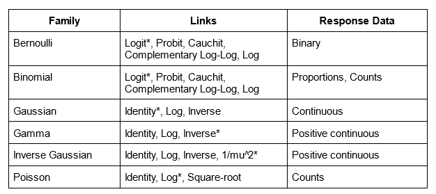
Generalised linear models possible error distributions
Poisson linear regression
Recall the Poisson distribution is a distribution of values that are zero or greater and integers only. The classic example of Poisson data are count observations–counts cannot be negative and typically are whole numbers. The Poisson distribution has one parameter, $(lambda), which is both the mean and the variance. A Poisson regression uses Log link (and therefore the coefficients need to be exponentiated to return them to the natural scale).
glm(y ~ x, family = poisson)
Binomial linear regression
Binomial regression is for binomial data—data that have some number of successes or failures from some number of trials. Let’s focus on the most common application of the binomial regression which is that when the number of trials is 1, which is often called logistic regression. The application of this model is when we have 1s and 0s as our outcomes, which often represent successes or failures, presence or absence, or any other binary outcome. The coefficients of a logistic regression model are reported in log-odds (the logarithm of the odds), which can be converted back to probability scale with the plogis() function. It is also worth noting that the estimate of p(50), or the probability of 50% for y, is calculated simply by taking the fraction of the negative intercept over the slope value.
glm(y ~ x, family = binomial)
##Example of binomial
iris$setosa <- ifelse(iris$Species == "setosa", 1, 0)


library(caTools)

set.seed(1)
split = sample.split(iris$Sepal.Length, SplitRatio = 0.75) ## create dataset split
train = subset(iris, split==TRUE) ## train split
test = subset(iris, split==FALSE) ## test split
y<-train$setosa; x<-train$Sepal.Length ## use sepal length as features
glfit<-glm(y~x, family = 'binomial')
summary(glfit)


newdata <- data.frame(x=test$Sepal.Length) ## convert data into dataframe
predicted_val <-predict(glfit, newdata, type="response") ## predict test set
prediction <-data.frame(test$Sepal.Length, test$setosa,predicted_val) ## cast prediction to dataframe
prediction
   test.Sepal.Length test.setosa predicted_val
1                4.6           1  0.9893396059
2                5.4           1  0.5193846862
3                4.6           1  0.9893396059
4                5.1           1  0.8516276448
5                5.1           1  0.8516276448
6                5.4           1  0.5193846862
7                5.2           1  0.7668856840
8                4.9           1  0.9458668740
9                5.5           1  0.3824793248
10               5.0           1  0.9092110734
11               4.4           1  0.9964728560
12               4.8           1  0.9682399616
13               6.4           0  0.0041167002
14               5.0           0  0.9092110734
15               5.8           0  0.1044354907
Key Points
GLM practical 1
Overview
Teaching: min
Exercises: minQuestions
Objectives
Exercise 1
Using the fishing data in the COUNT library, let’s model the relationship between total abundance (totabund) and mean depth (meandepth). Total abundance are counts, and we might hypothesise that abundances of fishes decreases with increasing depth.
install.packages("COUNT")
library(COUNT)
data(fishing)
Exercise 1 tasks and solution
Your tasks are as follows:
1) compare different GLM distributions—Poisson, Binomial, and Gaussian—to determine which version of the model provides the best fit. (hint using AIC might be a quick method)
2) Using your best model based on AIC and plot the line of best fit to the data. why not plot the other aswell
Solution
1) pois.glm <- glm(totabund ~ meandepth, data = fishing, family = poisson)
1) summary(pois.glm)
1) AIC(pois.glm)
1) result for poisson: [1] 16754.46
1) binomial model not possible: Error in eval(family$initialize) : y values must be 0 <= y <= 1
1) gaus.glm <- glm(totabund ~ meandepth, data = fishing, family = gaussian)
1) summary(gaus.glm)
1) AIC(gaus.glm)
1) result for gaussian: [1] 1954.792
1) as gaussian AIC is smaller than poisson AIC, gaussian provides better fit.
1) You could also run the following: 1) library(MuMIn) # install.packages(“MuMIn”)
1) model.sel(pois.glm, gaus.glm)
Exercise 2 (harder question)
Using the YERockfish data in the FSAdata library, let’s model the relationship between fish maturity (maturity) and length (length). Maturity is a binary response (immature or mature), and we might hypothesise that the probability of being mature increases with length. Be prepared this example will require some data cleaning!!!
> install.packages("FSAdata")
> library(FSAdata)
> data("YERockfish")
Exercise 2 tasks and solution
Your tasks are as follows:
1) Identify what is wrong with you data.
2) Clean your data and create a GLM using the binomial distribution.
3) Using your model plot the line of best fit to the data.
Solution
1) So looking at our data we can see that we have both missing values and our target labels are not in the form of 0 and 1.
2) YERockfish2 <- na.omit(YERockfish) # remove missing values
2) YERockfish2$maturity2 <- ifelse(YERockfish2$maturity == “Immature”, 0, 1) #convert Immature to 0 and mature to 1 and call the column maturity2
2) binom.glm <- glm(maturity2 ~ length, data = YERockfish2, family = binomial)
2) summary(binom.glm)
2) AIC(binom.glm)
Key Points