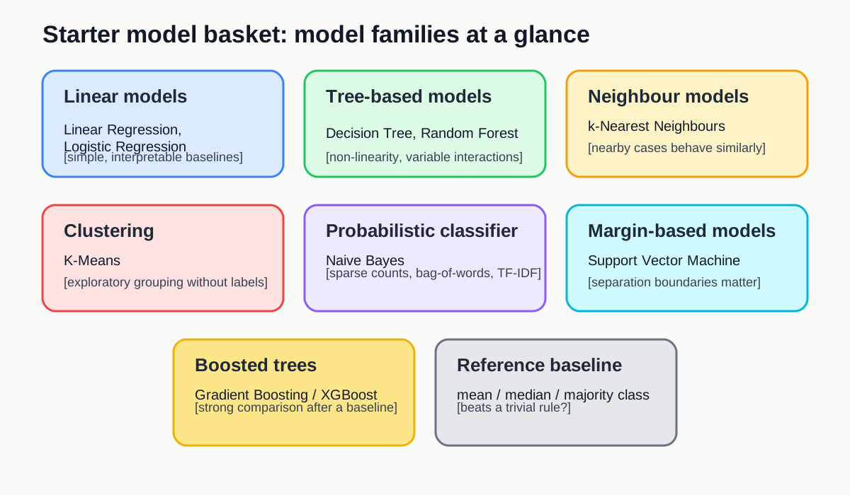
Image 1 of 1: ‘Summary diagram showing the main ideas behind baseline and comparison models in the starter model basket.’
Figure 2
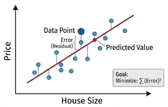
Image 1 of 1: ‘Illustration of linear regression fitting a straight-line relationship to continuous data’
Key
points: The model represents the outcome as a weighted sum of
the input variables. Learning means adjusting those weights to minimize
prediction error on a continuous target.
Figure 3
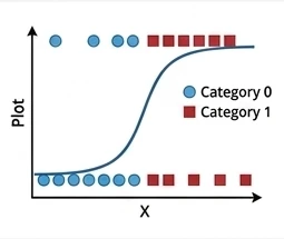
Image 1 of 1: ‘Illustration of logistic regression separating classes with a simple decision boundary’
Key
points: The model uses a weighted combination of the inputs and
then applies a logistic function to turn that score into a class
probability. Learning means adjusting the weights so the predicted
probabilities better match the observed labels, usually by minimizing
cross-entropy loss; it can be viewed as a neural network with no hidden
layer.
Figure 4
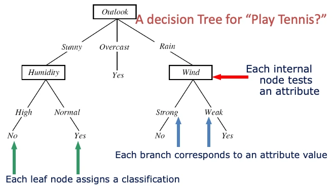
Image 1 of 1: ‘Illustration of a decision tree splitting data into interpretable rules’
Key
points: A decision tree represents the model as a sequence of
if-then splits. Learning means choosing splits that make the resulting
groups purer for classification or more consistent for regression.
Figure 5
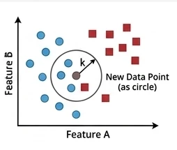
Image 1 of 1: ‘Illustration of k-nearest neighbours predicting from the closest training examples in feature space’
Key
points: k-nearest neighbours predicts from the nearest training
cases, where “nearest” is defined by a distance measure in the feature
space. For classification, it takes a majority vote across the
k neighbours; for regression, it can take their
average.
Figure 6
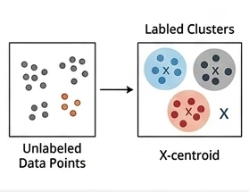
Image 1 of 1: ‘Illustration of k-means grouping points into cluster centres’
Key
points: K-Means represents each cluster by a centre point.
Learning means repeatedly assigning cases to the nearest centre and
updating the centres until the grouping stabilizes.
Figure 7
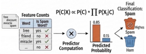
Image 1 of 1: ‘Illustration of Naive Bayes using class-conditional evidence from features’
Key
points: The model treats features as separate pieces of
evidence and combines them probabilistically for each class. Learning
mostly means estimating how often features appear within each class from
the training data.
Figure 8
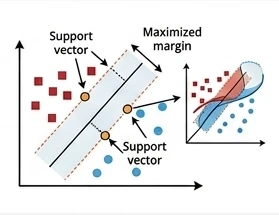
Image 1 of 1: ‘Illustration of a support vector machine finding a margin between classes’
Key
points: A support vector machine makes its decision using a
small set of key training cases called support vectors, rather than all
training points or the nearest neighbours. With a kernel function, it
can measure similarity between a new case and those support vectors in a
transformed feature space, which is why SVMs are often useful for
small-sample, high-dimensional problems, although fitting can become
slow because the optimization often involves a large kernel matrix.
Figure 9
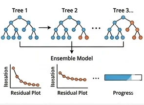
Image 1 of 1: ‘Illustration of gradient-boosted trees building an ensemble sequentially to correct earlier errors’
Key
points: XGBoost represents the model as a sequence of small
trees added one after another. Learning means each new tree focuses on
the mistakes or residual patterns left by the earlier trees.
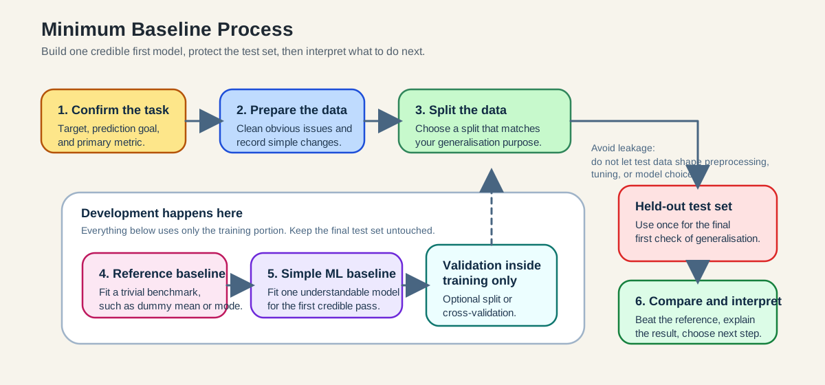
Image 1 of 1: ‘Diagram of the minimum baseline process: confirm task and metric, prepare data, split data, build baselines using only training data, evaluate once on the held-out test set, and interpret the next step.’
Figure 2
Image 1 of 1: ‘Illustration comparing underfitting, reasonable fit, and overfitting curves.’
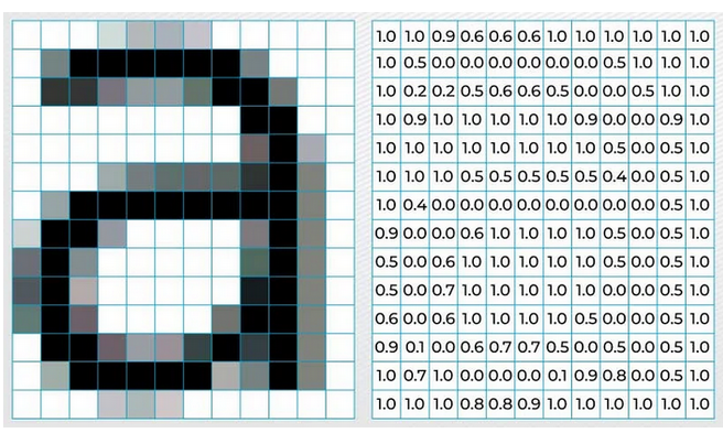
Image 1 of 1: ‘Illustration showing how image information is stored as pixel values.’
Figure 2
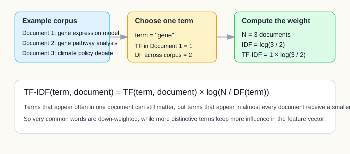
Image 1 of 1: ‘Diagram showing one simple TF-IDF calculation for the term gene across a small corpus.’
Figure 3
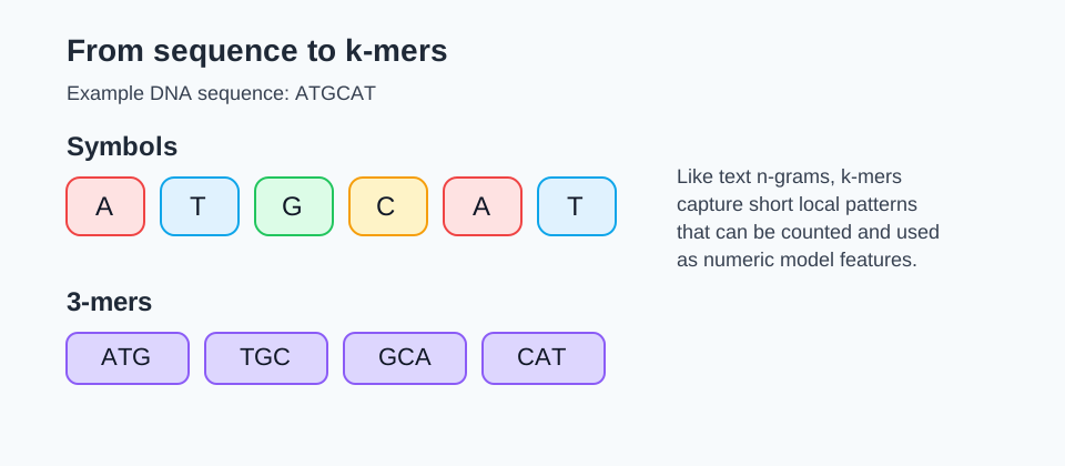
Image 1 of 1: ‘Diagram showing how a DNA sequence is split into symbols and 3-mers.’
Figure 4
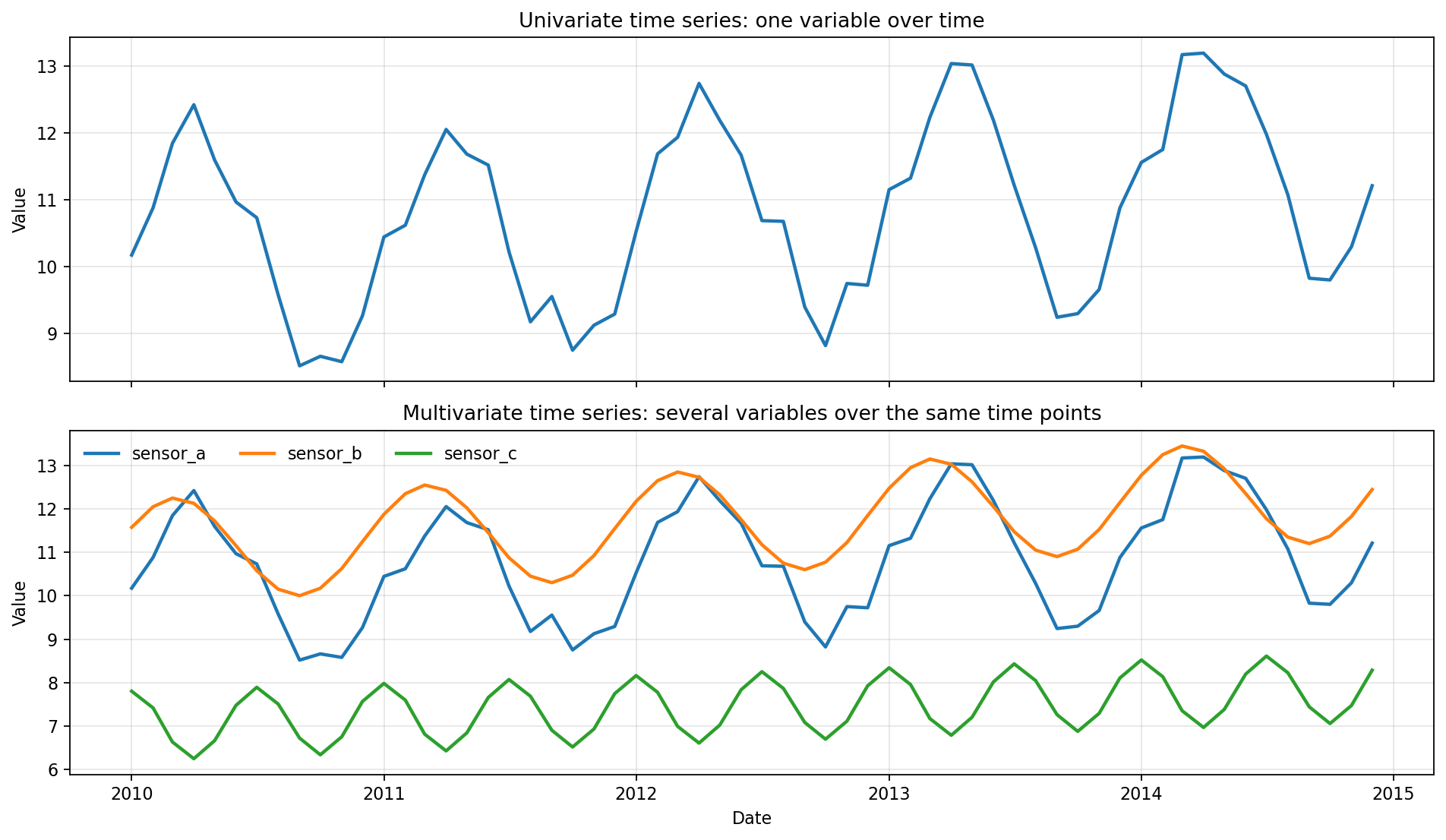
Image 1 of 1: ‘Illustration comparing a univariate time series with one measured variable over time and a multivariate time series with several variables recorded over the same time points.’
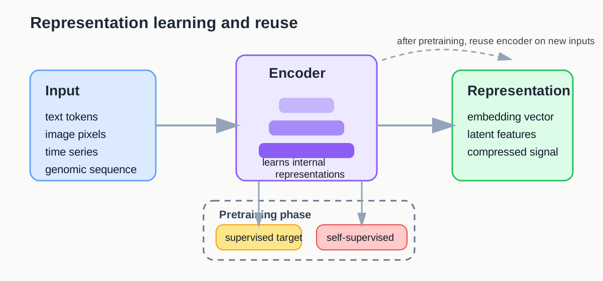
Image 1 of 1: ‘Diagram showing raw inputs transformed by an encoder into learned representations, trained through supervised or self-supervised objectives.’
Figure 2
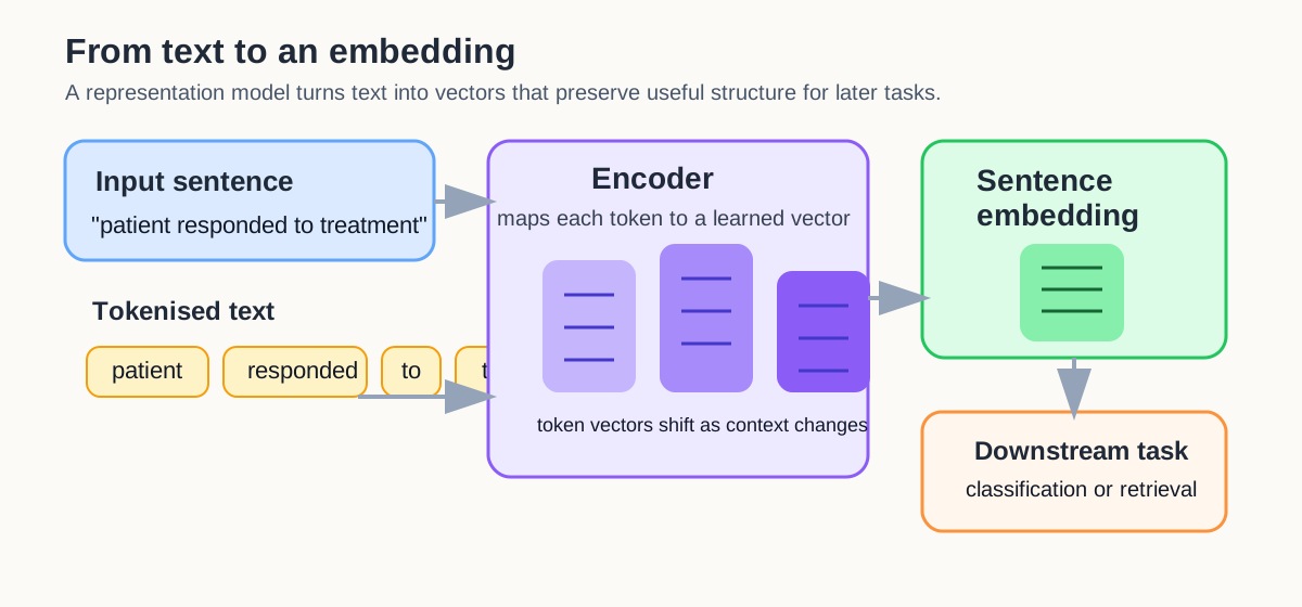
Image 1 of 1: ‘Diagram showing a sentence tokenised, mapped into token vectors by an encoder, then combined into one sentence embedding for a downstream task.’
Figure 3
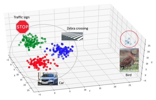
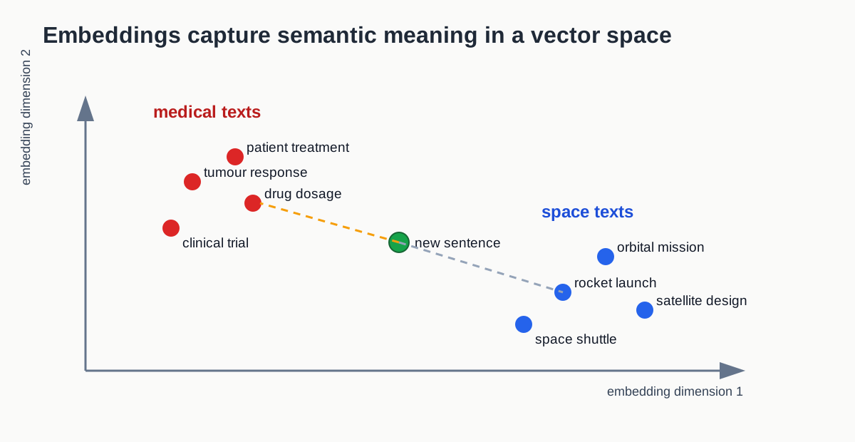
Image 1 of 1: ‘Schematic embedding space showing biology and space related texts forming separate regions, with a new example placed near its semantically similar neighbours.’
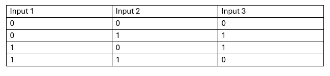
Image 1 of 1: ‘Illustration showing a limitation of a single perceptron on a nonlinearly separable pattern.’
Figure 3
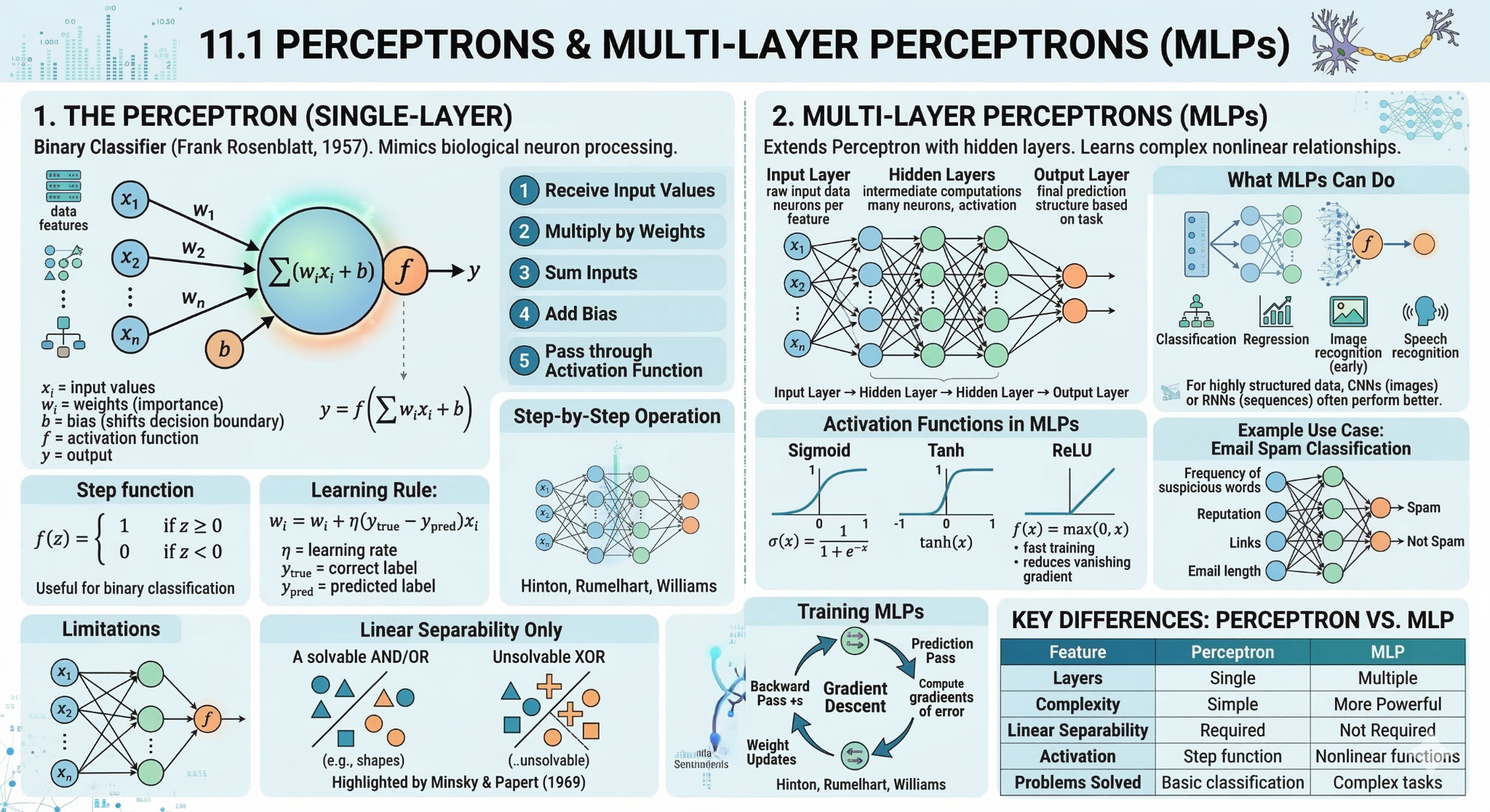
Image 1 of 1: ‘Diagram of a multilayer perceptron with input, hidden, and output layers.’
Figure 4
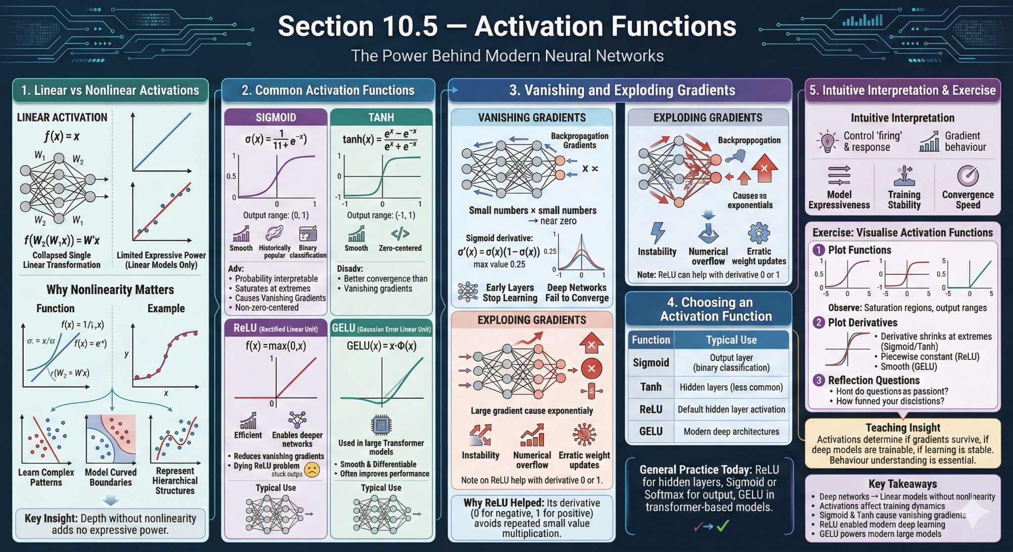
Image 1 of 1: ‘Examples of common activation functions used in neural networks.’
Figure 5
Image 1 of 1: ‘Illustration showing a limitation of a single perceptron on a nonlinearly separable pattern.’
Figure 6
Image 1 of 1: ‘Illustration showing a limitation of a single perceptron on a nonlinearly separable pattern.’
Figure 7
Image 1 of 1: ‘Diagram of a multilayer perceptron with input, hidden, and output layers.’
Figure 8
Image 1 of 1: ‘Diagram of a multilayer perceptron with input, hidden, and output layers.’
Figure 9
Image 1 of 1: ‘Schematic embedding space showing biology and space related texts forming separate regions, with a new example placed near its semantically similar neighbours.’
Image 1 of 1: ‘Schematic embedding space showing biology and space related texts forming separate regions, with a new example placed near its semantically similar neighbours.’
Figure 2
Image 1 of 1: ‘Schematic embedding space showing biology and space related texts forming separate regions, with a new example placed near its semantically similar neighbours.’
Figure 3
Image 1 of 1: ‘Schematic embedding space showing biology and space related texts forming separate regions, with a new example placed near its semantically similar neighbours.’
Figure 4
Image 1 of 1: ‘Schematic embedding space showing biology and space related texts forming separate regions, with a new example placed near its semantically similar neighbours.’
Figure 5
Image 1 of 1: ‘Schematic embedding space showing biology and space related texts forming separate regions, with a new example placed near its semantically similar neighbours.’

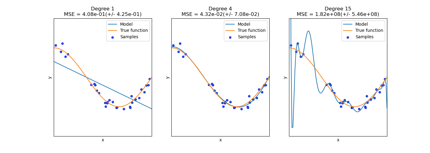 (Image from scikit-learn documentation: https://scikit-learn.org/stable/auto_examples/model_selection/plot_underfitting_overfitting.html)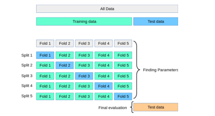
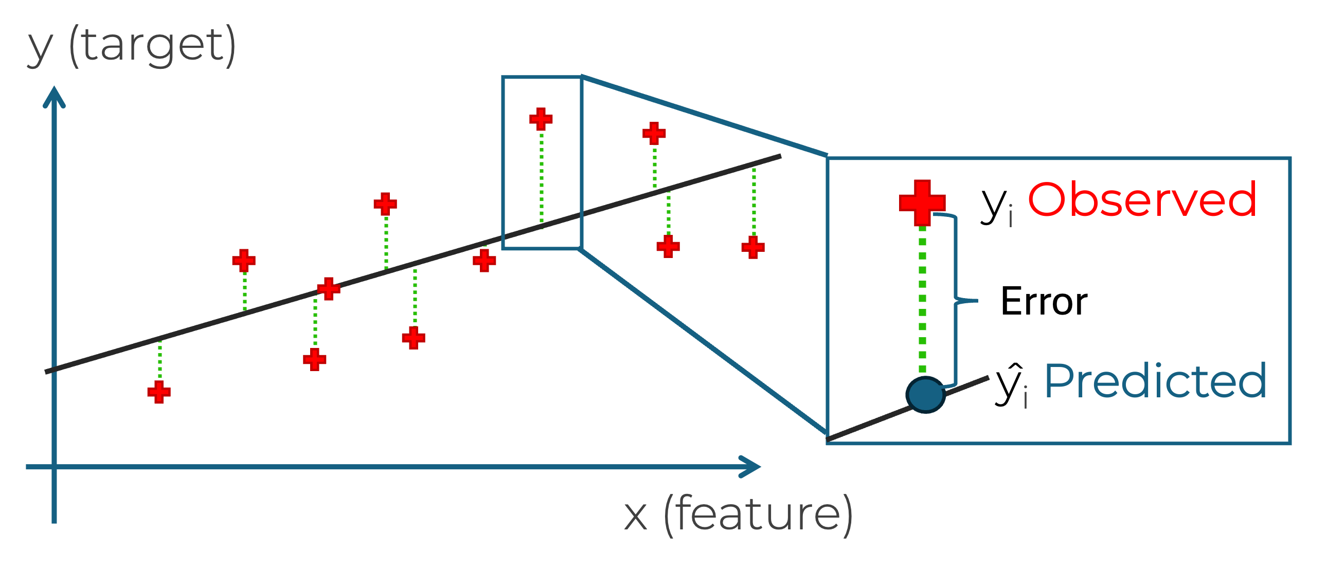
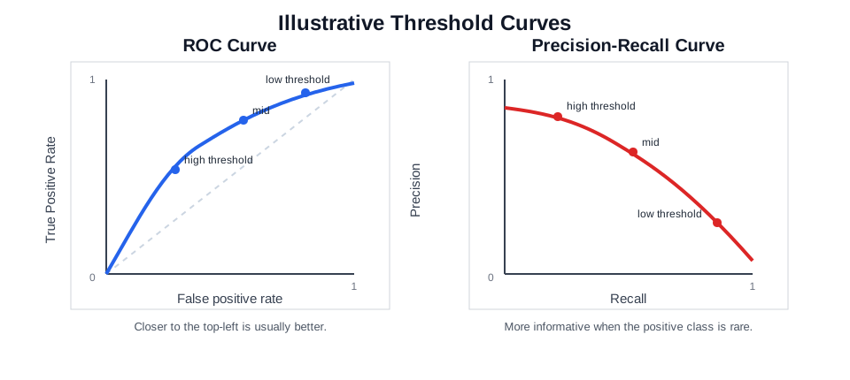
 .
. .
. .
.
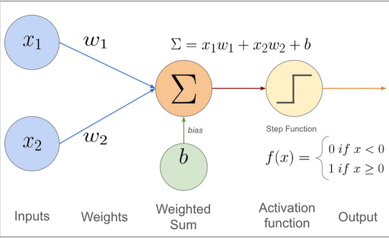 (cite:https://muneebsa.medium.com/deep-learning-101-lesson-7-perceptron-f6a698d81be8)